Project Luther - Analysis
Project Luther provides plenty of opportunity for playing around with data.
We have covered quite a lot of material related to linear regression techniques and issues over the last few days. Some of this felt like decent review, especially since I have done this both on HackerRank and via the MOOC series I was pursuing. Other parts were completely new to me. I now have a much better idea how to describe Ridge and Lasso Regression. And there was a lot of depth regarding a variety of issues.
One key takeaway, for example, was to be very wary of using R^2 for any sort of model comparison. Maybe use Adjusted R^2 since it is better for comparing modeling with different sets of features. But the idea is that R^2 will always increase slightly with added features even if those features have more predictive power. Even better still is just to focus on root-means-squared-error.
I have been digging into sklearn. There’s a lot of power here. So much so that it’s easy to jump into using these module, classes and functions with precious little degree of understanding.
There’s something to be said to coding stuff up from scratch to develop understanding.
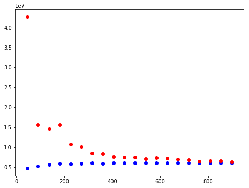
I ended up doing that yesterday. I was trying to repeat some of what we’d discussed with my current data and modeling. I wanted to SEE the model’s behavior. Is it “High Bias”, “High Variance”? It seemed easy enough to extrapolate from our work in train-test splits or cross-validation to create what I needed. I still feel so clumsy with Matplotlib. But I did it.
And then David (one of the instructors) came by and said “Oh, you recreated sklearn’s learning curve. Sheesh. Truth be known, if I’d know that was there, I likely would have just used it!!
Anyway, here’s what I did:
def sample_test_train(N,k,size,seed=False):
    ''' Create a set of train/test samples.
        The goal here is random sets of a certain size.
        There is no intention of these sets being non-overlapping.
        Size is same for both test and train unless the requested
        size is more than half of the N provided.
        Input:
            N    the size of the data
            k    the number or samples desired
            size the size of the samples desired
        Output:
            List of pairs of list of indices
    '''
    if seed:
        np.seed(seed)
    output = []
    for i in range(k):
        indices = np.random.permutation(N)
        output.append([indices[:size],indices[size:min(size*2,N)]])
    return output

def learning_plot(est,X,y,points=10,rep=10):
    """ Create a plot to visualize the learning of the model.
    Inputs:
        est    the estimator
        X      the features
        y      the target
        points the number of tests
        rep    the number of repetitions at each test size
    """
    x = np.arange(points)
    train_err = np.array([])
    test_err = np.array([])
    N = len(X)
    sizes = [math.ceil(0.9 * N * (1 + i)/points) for i in x]
    for size in sizes:
        train = np.array([])
        test = np.array([])
        for train_ind,test_ind in sample_test_train(len(X),rep,size):
            X_train = X.iloc[train_ind]
            X_test  = X.iloc[test_ind]
            y_train = y.iloc[train_ind]
            y_test  = y.iloc[test_ind]
            est.fit(X.iloc[train_ind],y.iloc[train_ind])
            train = np.append(train,
                metrics.mean_squared_error(
                    est.predict(X.iloc[train_ind]),
                    y.iloc[train_ind]
            ))
            test = np.append(test,
                metrics.mean_squared_error(
                    est.predict(X.iloc[test_ind]),
                    y.iloc[test_ind]
            ))
        train_err = np.append(train_err,train.mean())
        test_err = np.append(test_err,test.mean())
    plt.figure(figsize=(8,6))
    plt.scatter(sizes, train_err,c='b')
    plt.scatter(sizes, test_err,c='r')
This gives a “clumsy” picture like this:
So I then ran off and found the quasi-official sample function to use with the sklearn learning-curve fucntion. That ends up looking something like this:
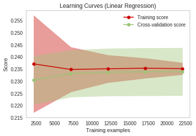
If it wasn’t humbling enough to switch to the “nice” functions and charts, the really sobering thing here is what both of these charts showed. After I’d had all that fun creating a robust scraping regimen to get tens of thousands of records, these charts underscored rather powerfully that for some instances, more data doesn’t really help.